For the cover design, I used the deep red color of the Texas A&M International University logo. The title of the issue had to be listed in three languages, which I distinguished between with color: English is in black, Portuguese in blue, and Spanish in gray. The other elements of the cover are the editors' names, the ICEBERG logo, and an image with an extensive description, each of which I placed in its own box to keep things organized and pleasing to look at.
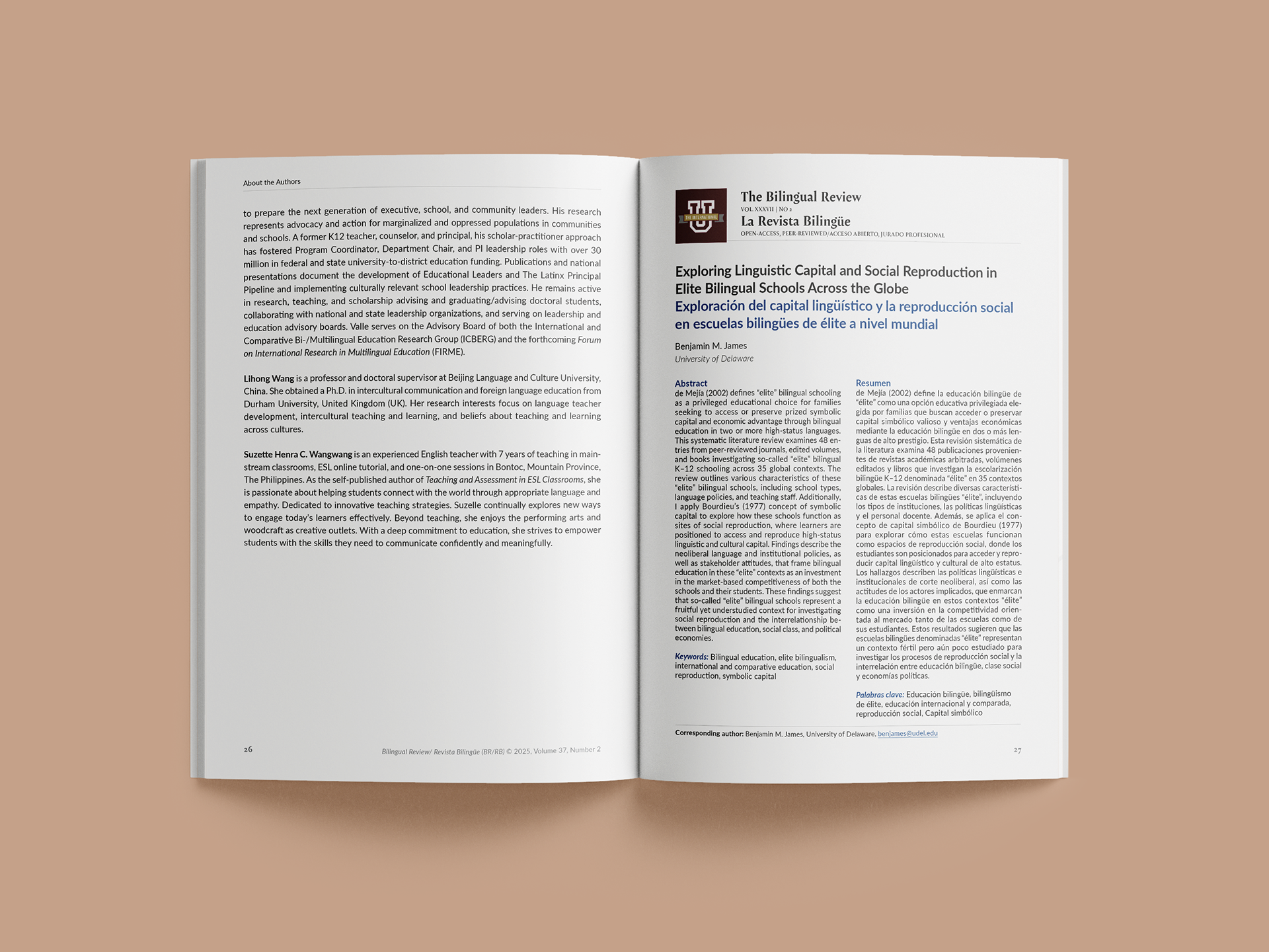
Each article begins with the journal title and issue number because the articles are available for individual download from the journal website. This makes sure users know where the article came from. Then the title is presented in two to three languages, and the abstract is presented in two languages.
Each article included extensive footnotes, headers, and sub-headers. We chose a friendly sans-serif font to keep the text readable and modern.
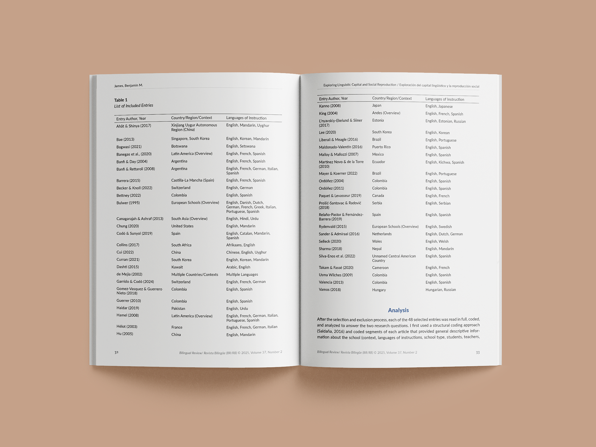
The interior typesetting had to follow APA 7th edition guidelines, with some flexibility. For instance, I formatted all the tables to adhere to APA guidelines.
Visit the journal's website to view the full issue: The Bilingual Review, Vol. 37 No. 2