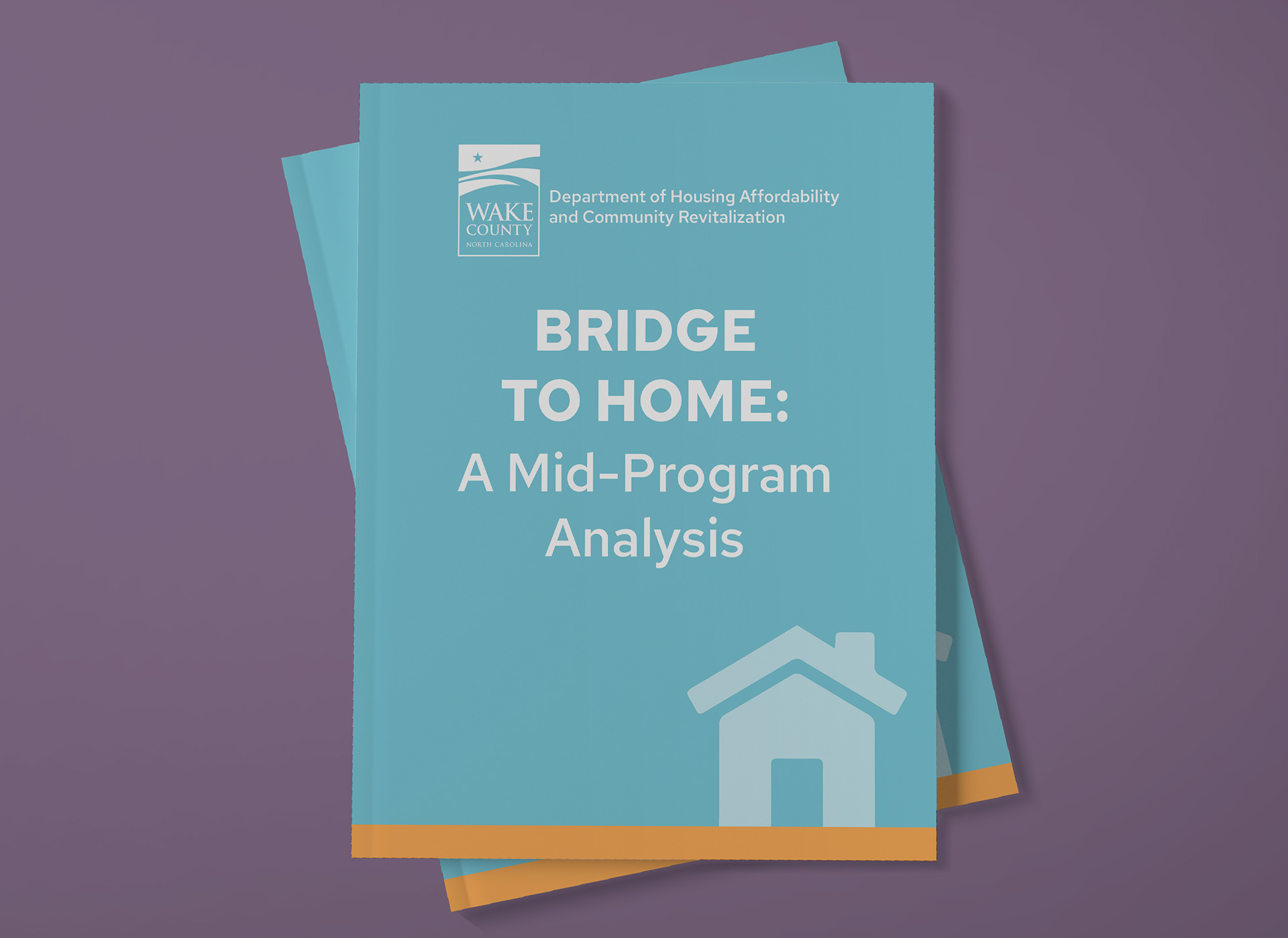
Project Summary
This was a report on homelessness prevention that had a tight publication deadline. The client's in-house team was unable to take on the project, so the client looked to outsource the design so that the report would receive the visual treatment that the important content deserved.
We got started with a discovery call. We discussed the target audience of the report: partner agencies and elected officials. The goal of the report was to show that this program is effective and worth funding and implementing. The target presentation style would be both friendly and professional, but not too commercial or academic.
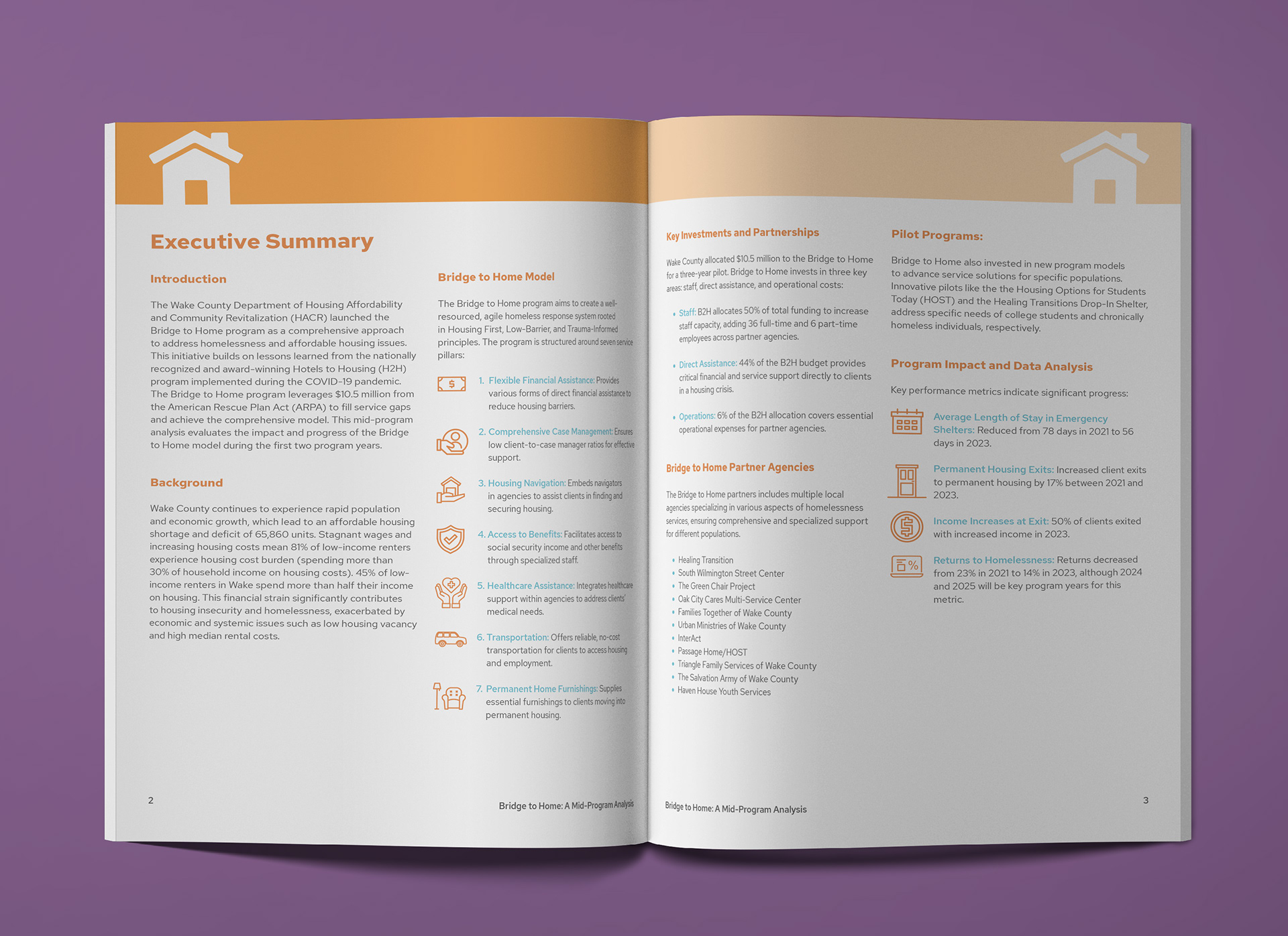
A three-page executive summary started off the report.
I sourced free-to-use icons to enhance the presentation of lists on these pages.
I started on the layout of a few pages, following the brand colors, fonts, and templates established in previous publications. Once these pages were approved, I followed through with the layout of the complete report. We completed the digital-first project with two rounds of revisions, on time and on budget!
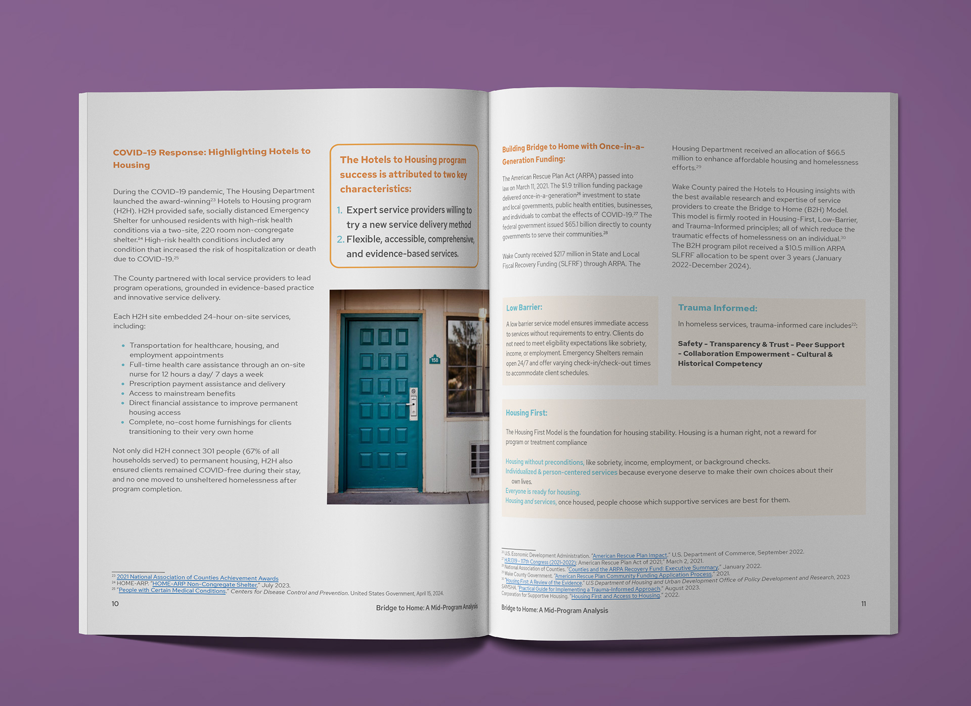
I used a callout design to emphasize key points of the report.
Definitions of terms were presented in shaded boxes with lower emphasis.
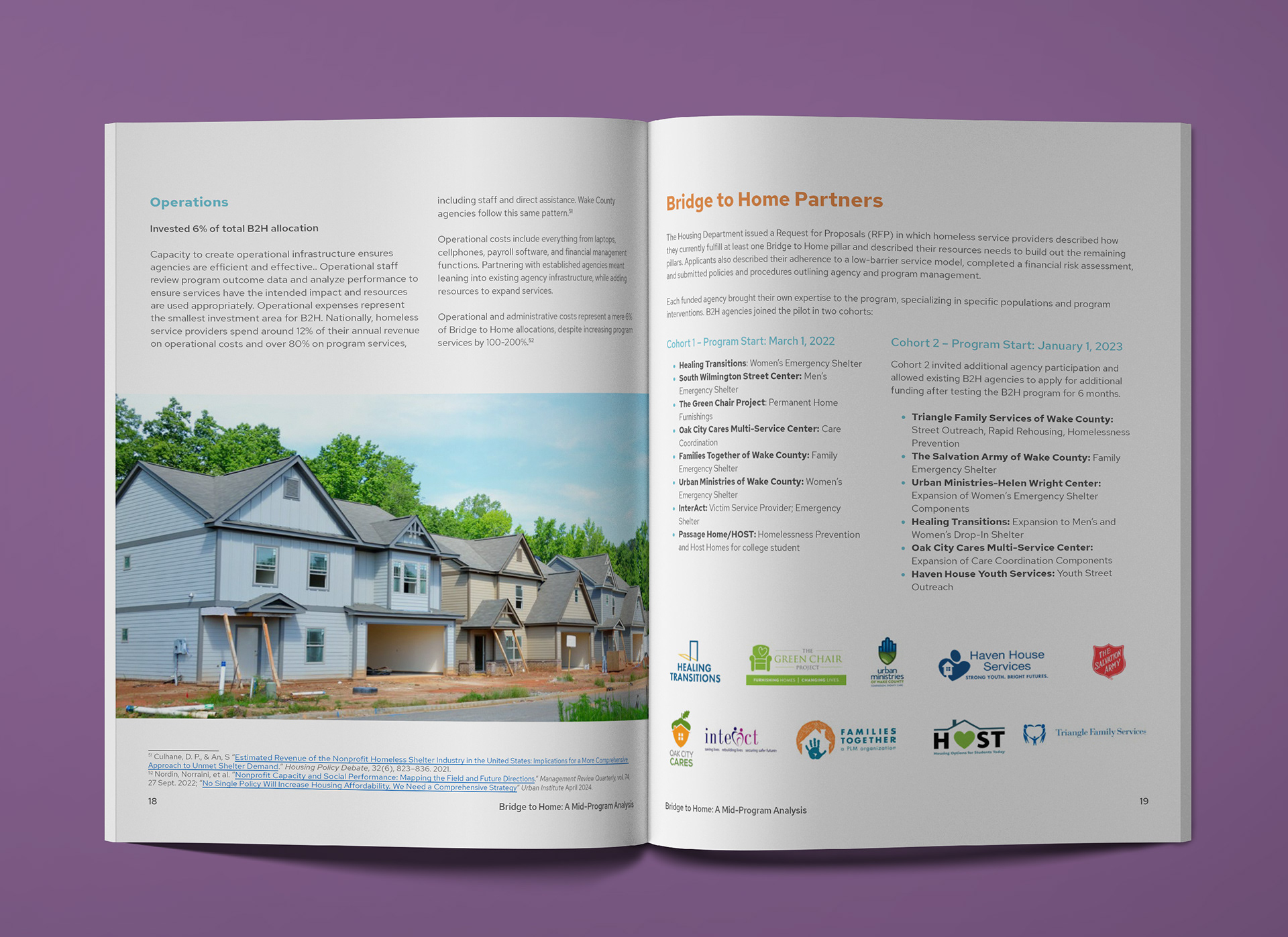
I sourced free-to-use photos to use at several points in the report.
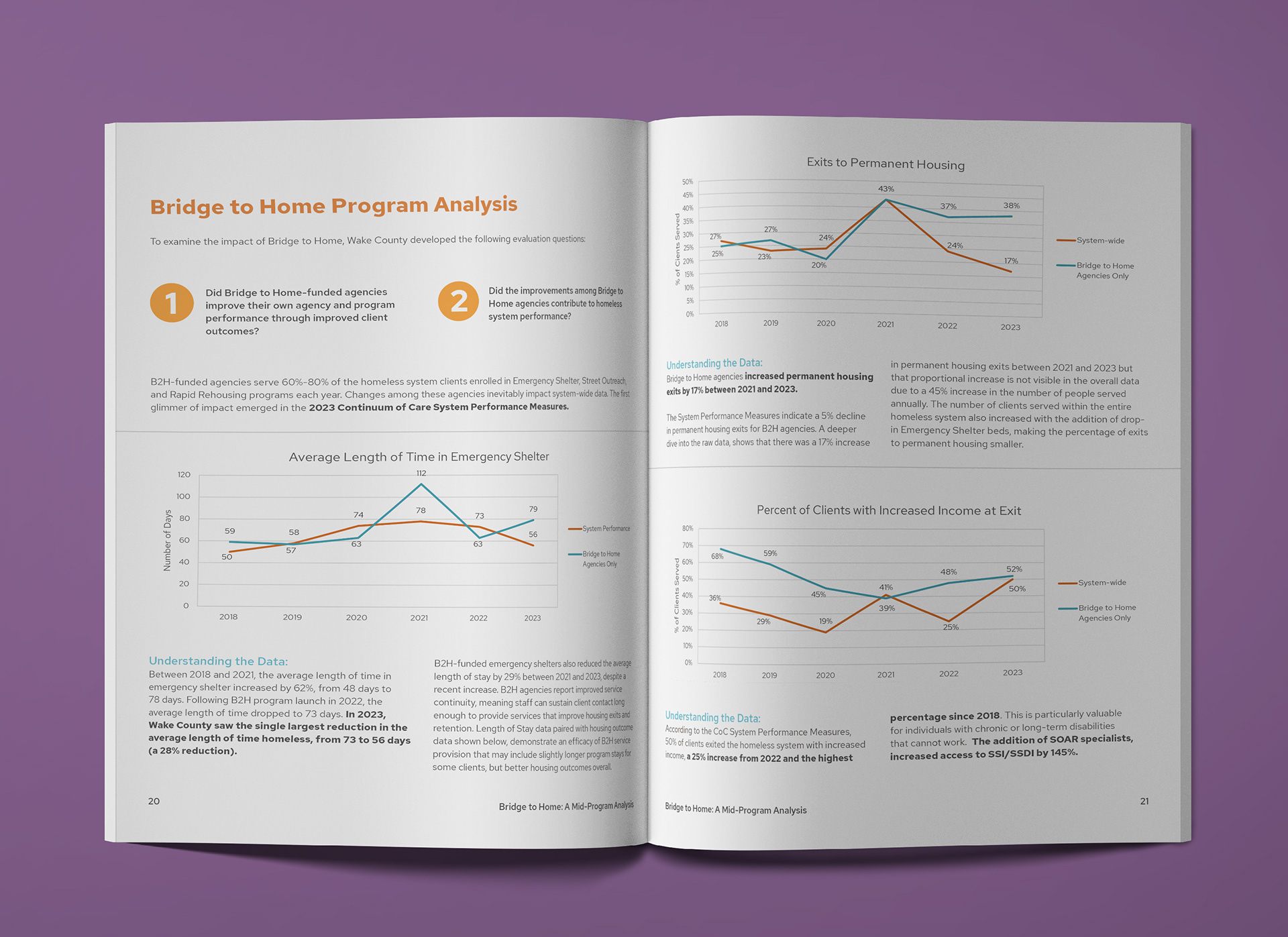
The report included five graphs that I redesigned in Excel to match the brand colors and fonts.
View the full report on the Wake County government site here: